These cards were created as 4 x 6 inch postcards for printed mail distribution. An E-card version was also created for electronic distribution. Each card, in its respective series, has been uniquely crafted as a photo montage to match the card’s purpose and intent.
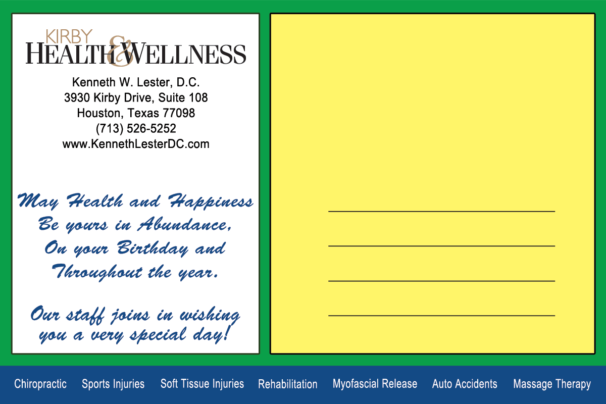
Birthday Card for Printed Mail-out
A core philosophy of Kirby Health and Wellness is a Holistic approach to treatment, our human connection to nature and the universe as a whole. The Birthday card celebrates our connection to nature. A roaring waterfall, the bubbling sound of a moving brook or creek can invoke a feeling of peace and gratitude. What better a day to be alive and celebrate then one’s birthday.
Front Side – Click on the image for a larger viewAddress and Message Side – Click on the image for a larger view
Assets used to create the montage for the front side of the card.
Birthday E-Card
The E-card version combines the front photo montage with the message on the address side of the card. The design background uses square elements mimicking an element of the Clinic’s Business Card. The business’s name and logo are prominently displayed at the top.
The card message: “May Health and Happiness be yours, In Abundance on your Birthday and, Throughout the year. Our staff joins in wishing you a very special day! Happy Birthday!”
This piece was created as a tribute and memorial to my dearest sister and best friend, Eloise Schwab. She left March 19, 2014 to join her maker and those that came before her. While loved by all who knew her, no one shall miss her more than I.
Conception and Idea
A month had passed by since her death. The previous two months had been somber with rigorous travel schedules to include in the midst of the unfolding reality.
Returning home, sad and tired, it was time to get down to business, and get the taxes done. The aftermath usually includes going through and cleaning out the file box. Moving through the task, I happened to go through a file folder named Personal. In it, is material that gets stashed away because it is either neat stuff or may mean something some day.
Systematically reviewing each item in the folder, I came across two worn printed pages containing the text content of this letter. The pages were dated 1998 and the original was signed from Jean. There was no source of where they came from. Jean’s words were moving to say the least and I credit her for moving me to produce this piece.
It was no accident those pages were printed and filed that day so many years ago.
Technique and Production
Composite image was produced in Photoshop CS6. More to follow.
These cards were created as 4 x 6 inch postcards for printed mail distribution. An E-card version was also created for electronic distribution. Each card, in the series, has been uniquely crafted as a photo montage to match the card’s purpose and intent.
Wellness Card for Printed Mailout
Crafted with Zen in mind, this card sends a message of Peace, Balance and Well-Being.
Front Side – Click on the image for a larger viewAddress Side – Click on the image for a larger view
Assets used to create the montage for the front side of the card.
Top Left: Japanese garden lagoon with beautiful reflections of the trees on the water.
Top Right: Minnehaha Creek, in Minneapolis, Minnesota, as it heads to the Mississippi River.
BottomLeft: Stone bridge across a pond.
Bottom Right: Red Asian style bridge over a brook.
Wellness E-card
The E-card version combines the front photo montage with the message on the address side of the card. The design background uses square elements mimicking an element of the Clinic’s Business Card. The business’s name and logo are prominently displayed at the top.
The purpose of these posters is to attract and invite the viewer to engage and become more informed on this controversial legal and social issue.
The “For Poster” Invites the viewer to engage the truth as it has evolved since 1970. Should the viewer choose to research the topic, they would find the majority of people in the prison system are there for drug related offenses.
Originally created and produced in 2009, the information presented is current for 2021 -2022.
Seems Normal, Legalize it!
Is legalization, de-criminalization, or both, the best overall solution for the well being of our society and our country?
The “Against Poster” Attempts to engage the viewer to make a personal choice and use good sense. If this drug was legal, would you use it? As with all other legal substances, would you use this substance in a responsible and respectful manner; and one that speaks to moderation?
Seems Normal. if it was legal, would you choose yo use it or at least try it.
Originally published as a Portfolio collection in the Fall of 2010. Its purpose was to showcase a wide variety of work in different formats from approximately 2002 to 2010.
Built in HTML and CSS, the site uses an XML file to present the information for the projects presented. The file is expressed using XSL stylesheets.
Bill Schwab Design Home Page 2010
What is XSL?
XSL is a language for expressing style sheets. An XSL style sheet is, like with CSS, a file that describes how to display an XML document of a given type. XSL shares the functionality and is compatible with CSS2 (although it uses a different syntax). It also adds:
A transformation language for XML documents: XSLT. Originally intended to perform complex styling operations, like the generation of tables of contents and indexes, it is now used as a general purpose XML processing language. XSLT is thus widely used for purposes other than XSL, like generating HTML web pages from XML data.
Advanced styling features, expressed by an XML document type which defines a set of elements called Formatting Objects, and attributes (in part borrowed from CSS2 properties and adding more complex ones.
How Does It Work?
Styling requires a source XML documents, containing the information that the style sheet will display and the style sheet itself which describes how to display a document of a given type.
The project’s purpose is to create a montage art piece using original photos and advanced image editing techniques. This piece was created using eight separate photographs. All photos are original and taken by William Schwab.
The Garden of Surrealistic Tranquility
The completed piece seeks to straddle the lines of what is real and what is not. The final piece measures approximately 28″ x 22″.
Supporting Foreground and Sky Images
Design tools: Photoshop
Photography, artwork, and design concept by William Schwab
This Web Site was developed and produced for Complete Property Services LLC. Its purpose was to create a web presence for a new company startup providing pertinent information for prospective clients. The site was archived June 2013 and replaced with a content management system more in line with todays standards.
Complete Property Services Home Page
Site produced by: The Gold Pixel Bit Group
Project Manager: William Schwab
Designer: Nita Jesran
Production Artist and Associate Designer: Wesam Elkot
This site was designed, developed and produced for Catering By Culinaire. The project’s purpose is to create and establish a successful Web presence for a successful catering company in Houston, Texas.
Catering by Culinaire Home Page
The project’s primary goal is too provide information about the company to current and prospective clients
Designed, developed and produced for Chill Safe, the project’s purpose is to create and establish a successful Web presence for a new company startup, specializing in Air Conditioning protection units in Houston, Texas.
Chill Safe Home Page
The project’s primary goal is to provide information about the company to current and prospective clients.
Erock! Design.com was conceived and created over a period of time during 2004 and 2005. The purpose and intent was to create a portfolio presentation showcasing some of my signature projects in graphic design, web design and experiments in motion design.
Built entirely in Flash, I wanted a presentation that was both eye catching and engaging. Many hours of research, study and production were required to get the final piece of work just right.
The site was up live from 2005 through 2010, at erockdesign.com. While I retain control over the domain, it is currently inactive.
With the advent of html5, css3 and design trends moving toward search engine friendly websites, it was time for Erock to retire.
Erock Design Interface
Client: Myself
Owner: William Schwab
Created and Published: 2004 – 2005
Site design and production by William Schwab.
Bill Schwab Design 2010
Originally published as a Portfolio collection in the Fall of 2010. Its purpose was to showcase a wide variety of work in different formats from approximately 2002 to 2010.
Built in HTML and CSS, the site uses an XML file to present the information for the projects presented. The file is expressed using XSL stylesheets.
Bill Schwab Design Home Page 2010
What is XSL?
XSL is a language for expressing style sheets. An XSL style sheet is, like with CSS, a file that describes how to display an XML document of a given type. XSL shares the functionality and is compatible with CSS2 (although it uses a different syntax). It also adds:
A transformation language for XML documents: XSLT. Originally intended to perform complex styling operations, like the generation of tables of contents and indexes, it is now used as a general purpose XML processing language. XSLT is thus widely used for purposes other than XSL, like generating HTML web pages from XML data.
Advanced styling features, expressed by an XML document type which defines a set of elements called Formatting Objects, and attributes (in part borrowed from CSS2 properties and adding more complex ones.
How Does It Work?
Styling requires a source XML documents, containing the information that the style sheet will display and the style sheet itself which describes how to display a document of a given type.
The poster is presented as a piece of contemporary art. Its purpose is to invite artists to submit their works for a touring exhibition. Text information and logos were pulled from a simple postcard and transformed into a 17 x 11 inch poster.
Version 1
The original background design was conceived and executed using Illustrator 10. It was further enhanced and adjusted using Photoshop CS3. The final published work was laid out using the text and the text design modifiers available in Adobe inDesign CS3. Provided logos were re-produced and enhanced using Illustrator CS3 and Photoshop CS4.
Version 2
The top image is the original submitted version while the bottom image has been edited to be more content friendly.
The purpose is to design a stellar party invitation for a fun loving couple. The client provided family photos to incorporate into the design. Three different composition sets were offered for review. The client chose this set for the final printed invitation.
Front and Back Side
Produced in Adobe Illustrator and Photoshop CS4.
Quadra: The Birthday Event 2005
This project was designed for a group of gentlemen celebrating their annual Birthday Party. The invitation was originally conceived as a 4″ x 6″ printed card for personal distribution by the respected hosts, with a front and back side.
Front and Back side
Quadra: The Birthday Event 2006
This project was designed for a group of gentlemen celebrating their annual Birthday Party. The invitation was originally conceived as a 4″ x 6″ printed card for personal distribution by the respected hosts, with a front and back side.
Front and Back Side
Quadra: The Birthday Event 2008
The project purpose is to design a Birthday Party Invitation for a fun group of friends. The client has a preference for blues and purples as a color scheme. The completed piece successfully communicates the message.
Front and Back Side
Quadra: The Final Event 2011
The evite was designed for a group of gentlemen celebrating their annual Birthday Party. The invitation was originally conceived as a 4″ x 6″ printed card for personal distribution by the respected hosts, with a front and back side. When electronic distribution was chosen as the major distribution route, the front and back sides of the design were combined, modified and merged to maintain its integrity. The design was then optimized for internet use.
The primary distribution route was email blasts, host blogs and Facebook Events.
Front and Back Side
All of the Quadra Invitations were produced in Photoshop CS4.
The project objective is to create a Menu for a fictional Restaurant named “La Nuit en Café Rouge de Satin”. The restaurant is French and features a variety of classic dishes and bistro offerings. The charge is to design a menu that speaks both to the restaurants name and the food it offers.
A simple parchment paper design was selected to invoke an old world charm. An elegant photograph is woven into the title page for visual interest. For design consistency, Kuenstler Script LT Std was selected as the primary font.
In its completed form, it is a tri-fold piece, eleven by seventeen inches high and wide.
Cover and outside of Tri-foldMenu Draft 2 – Inside
This menu was a featured project in the HCC West Loop Digital Design Art Gallery in Houston, Texas. (2009 – 2010)
Photoshop CS4 is the tool used to process the menu cover image and create the illusion of parchment paper, with the design comp created using inDesign CS3.
The project was created and produced in 2008.
Purpose: Create a Technical Drawing resulting in photographic realism. The subject matter for this piece is the SONY Cyber – Shot Digital Camera, Model # DSC – S85, 2002. The front side of the camera is presented in this illustration.
The piece is presented in three different variations:
A Cover Sheet
A more detailed Cut Sheet
The cover for a Manual
The second illustration uses the back side of a newer model. Software used: Adobe Illustrator and Photoshop Design Concept and Artwork by William Schwab.
Purpose: Create a postage stamp for a fictitious place. From the Starlight Mint accents and the candy cane light poles, the Yellow Brick Road leads the eye to the Emerald City.
Kozlandia is OZ converging with Candyland. Software used: Adobe Illustrator Design Concept and Artwork by William Schwab
I hope you like my custom crafted castle, candy canes, and starlight mints!
Project purpose: Using original photographs, create an art piece in the space of re-contextualization, futurism and symmetry. As a basis, this piece draws its base of creation from 5 non – objective photos and special effects objects created in Photoshop.
Software used: Adobe Photoshop
Original photos, Design Concept and technical expertise by William Schwab, Summer 2004.
The Landing